I believe a well constructed Raster chart is always superior to a vector chart when constructed using the same underlying data. More specifically for US waters I would never rely on NOAA vector charts when NOAA raster charts are available.
The main difference is that raster charts were ‘rendered’ by a skilled human using a set of assumptions refined by a standards body over decades. Vector charts are rendered by software using assumptions customized by you, the user. Software written by programmers who might be cartographers or mariners but are not necessarily either. I’m a software developer and I trust the skilled human way more than software any day of the week and twice on Sunday.
Vestas Wind
The most famous example of vector charts misrepresenting the environment is probably here:
Vestas’ vector chart software didn’t have the data downloaded necessary to enable safe navigation but it probably drew a picture that said “insufficient data” in small print and generated what looked like the chart of areas where it had sufficient data. A small scale raster chart of that area would clearly mark the area as “danger”; and if one were to zoom in the picture would immediately look wrong as raster chart software doesn’t know how to draw a chart at all, let alone approximate one using insufficient data.
But they were using software I can’t afford and charts I don’t have to compare. Next I’ll show you the kind of misrepresentations I’ve come to expect from vector charts.
George’s Shoal
An example closer to home is George’s shoal 100nm East of Cape Cod. Some of the boats I sail aboard could run aground there. This is what George’s Shoal looks like on the raster charts; from all the way zoomed out to all the way in using MxMariner:
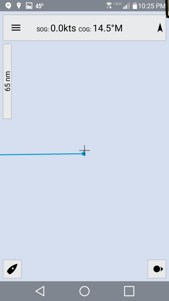
It’s obvious that we simply don’t have data at this scale. So we try zooming in a bit:
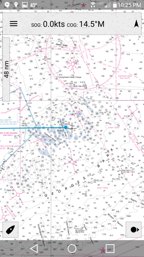
There it is! In a chart showing thousands of miles you can see there is an obstruction. Let’s keep zooming in:
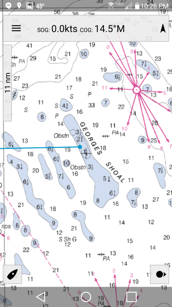
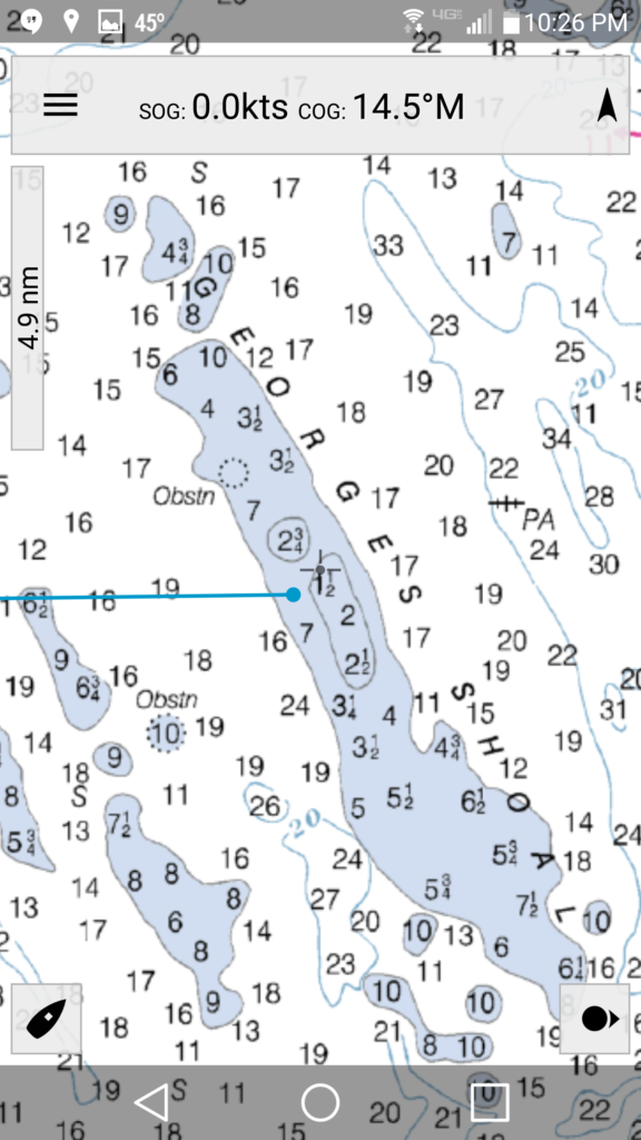
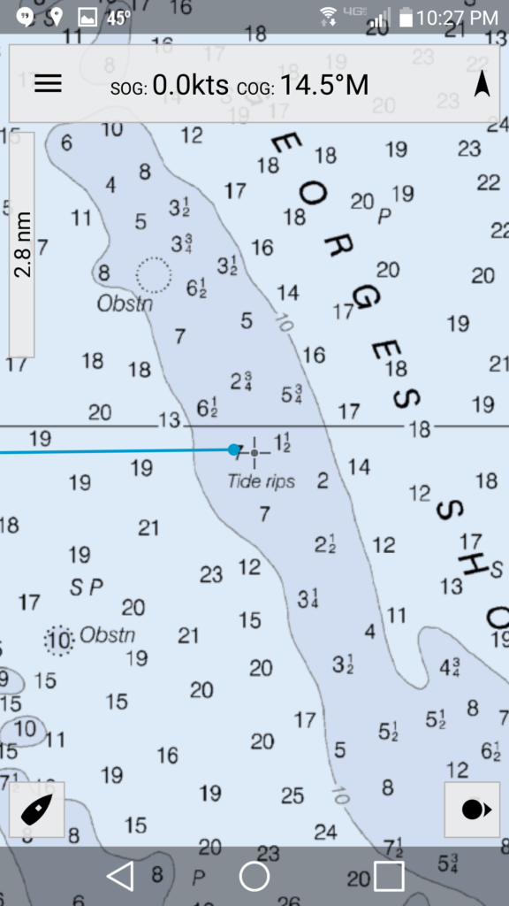
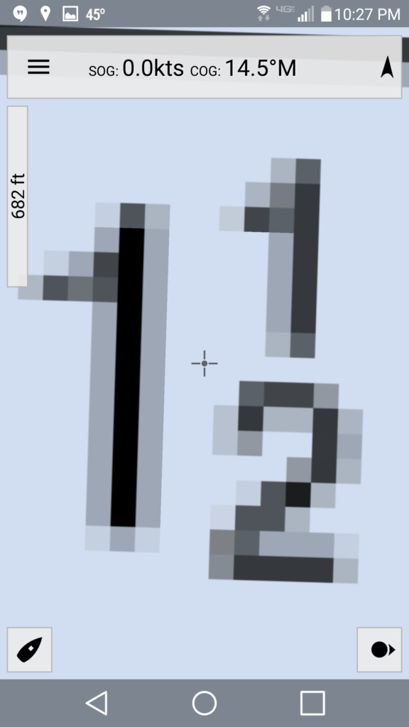
And now we can clearly see that we’ve zoomed too far in. On a boat that draws 10′ this giant 1.5 fathom area is to be avoided. The raster charts are clear: they either show you the area to be avoided clearly or indicate that they’re not showing you detail at the level you’re looking at.
On to Vector charts. I can’t get George’s Shoal to show up in Navionics while zoomed out for the life of me. Using the NOAA or Navionics (pay) data zoomed out it looks like hundreds of feet of water:
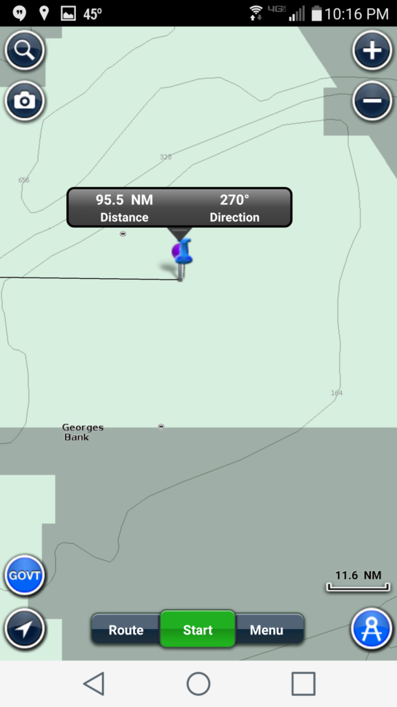
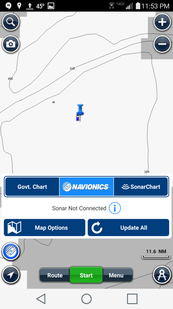
Both contours show 164′. 164′ ought to be no problem, right? But, if you zoom in enough using the NOAA data Navionics renders this as a danger area:
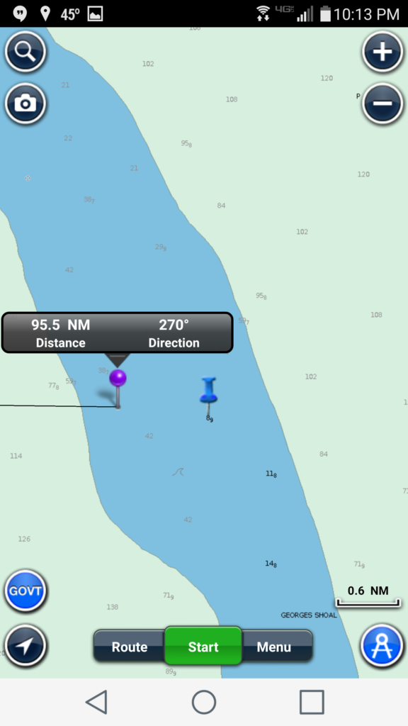
using the Navionics data of the area zoomed in the shallowest area (9′ of water) is (erroneously?) white, indicating safe water. It’s a little bit terrifying.
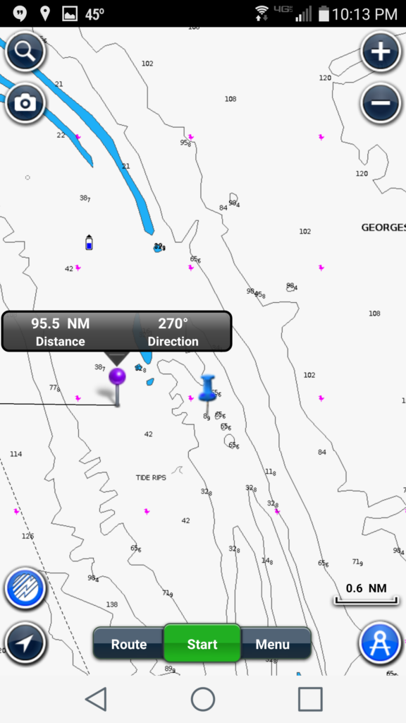
The data is there. You can see the waypoint is right on the 8.9′ indicator. But there is no blue indicating shallow water even though the surrounding 20’+ areas are blue.
Working from the same cheat sheet
There is also something to be said for the “testing” that occurs when every mariner transiting an area using raster charts winds up looking at the exact same image representing the environment. If there is something wrong with that rendering if the area there could be hundreds of mariners who might discover the problem with their keel before you do with yours. On a vector chart, depending on your settings, you might be the very first tester of a particular rendering of the chart data.
Conclusions
I own Navionics and have renewed my subscriptions to their data for the last three years. There are plenty of areas that I’ve sailed where Navionics data are known to be the most up to date and accurate one can get on a smartphone or the only data one can get on a smartphone. Moreover, I’ve never been on a boat that had a raster based chart plotter; all of the chart plotters that I’ve worked with are based on vector chart data. I’ve used Navionics and these vector chartplotters for navigation; they were the best sources for navigation information available to me and we arrived without incident.
But wherever I can I download and raster charts of the area and use them as my primary source of navigation information. When I only have access to vector charts I always try to cross check their information against another system. I treat the information gained from vector based systems skeptically and this extra caution has served me well over the years. While George’s shoal is the most poingant and persistent misrepresentation I’ve come across in vector based charts it’s far from the only misrepresentation. I advise you to do the same: favor raster charts and be skeptical of vector chart information that you can’t cross reference.
Be careful out there!
Good advice , point well made